Project Page

Art Direction
at iFood.

Art Direction,
Content, Motion

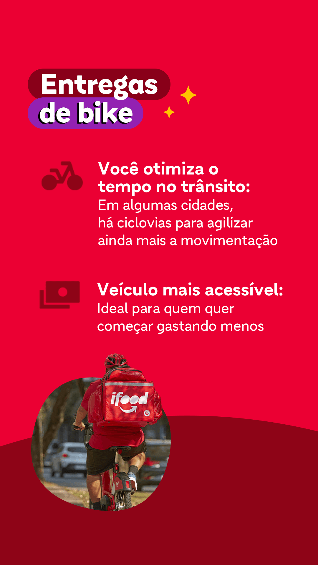
Creating content and visual strategies for iFood’s delivery partner community, focused on clarity, engagement and connection.

(scroll down)

About iFood

Connecting with the people who keep the platform moving.


iFood brings together a large ecosystem of consumers, restaurants and delivery partners across Brazil.

Within this ecosystem, delivery partners form a community with their own routines, needs and relationship with the platform. Our work focused on creating communication specifically for this audience, building content and visual strategies around their context and everyday experience.

01. Content & Visual Strategy

Communication shaped around a specific community.

Working with the iFood Entregadores channels meant understanding a very specific audience, with its own routines, needs and relationship with the brand.

The creative approach combined clear communication with a flexible visual language, adapting content to different topics and moments while maintaining consistency across the channel.

02. Building

Connection

Creating content that feels relevant, recognizable and close to the audience.


From everyday information to engagement-driven content, each piece was developed around the context of delivery partners and the role iFood plays in their daily experience.


The result was a communication approach focused on strengthening the connection between the brand and its delivery partner community.

The result was a communication approach focused on strengthening the connection between the brand and its delivery partner community.

Reflection

Clarity builds connection.


Working with iFood reinforced how context can shape creative decisions.


Understanding the audience, the channel and the purpose behind each message helped create communication that was clearer, more relevant and more consistent.

Next Project

Continue to the next case study

Branding · UX · 2026

Create a premium personal portfolio homepage inspired by Apple, Airbnb, Linear and Vercel. The page should feel editorial, minimalist and timeless, with generous whitespace, large typography and smooth scroll. Navigation: Transparent navbar with the logo "Victor Bianchi" on the left and Work, About, Resume and Contact on the right. The navbar becomes solid while scrolling. Section 1 — Hero (100vh) Display a clean full-screen hero with no background image. Headline: Building brands, digital experiences and content systems that drive measurable business growth. Small label above: Creative Lead Supporting text: Currently leading Creative, Branding and Content initiatives at Livance. Bottom left: São Paulo, Brazil Bottom center: Animated scroll indicator. No CTA buttons. Section 2 — Manifesto Large editorial typography. Text: I believe design isn't about making things beautiful. It's about helping businesses grow, building trust and creating experiences people remember. Animate each paragraph with a subtle fade-up while scrolling. Section 3 — Featured Project Large full-width image with rounded corners. Project: Livance Description: Scaling one of Brazil's leading healthcare brands through branding, content strategy and AI-powered creative systems. Project information: Creative Direction Brand Strategy Content Marketing AI Workflows 2025 — Present Minimal "View Case" link. Section 4 — Selected Work Responsive two-column grid. Projects: Livance Mastercard iFood Elo7 Itaú Playground Happen Each project is displayed as a large image card with the title below. On hover: Scale image to 102% Lift card slightly Smooth transition Section 5 — Impact Four large metrics displayed in a clean grid. 20% Lower CAC +40% Higher CTR 100+ Creative Assets Delivered AI Creative Workflows Large numbers with subtle labels. Section 6 — Contact Centered layout. Large headline: Let's build something meaningful. Minimal rounded button: Get in Touch Very spacious footer with LinkedIn, Behance, Instagram and Email. Design System Pure white background. Black typography. Neutral gray palette. Accent color only for links. No gradients. No glassmorphism. No colorful sections. No unnecessary decorations. Typography similar to Apple SF Pro, Inter or Neue Montreal. Rounded corners between 20px and 32px. Subtle borders. Very soft shadows only when necessary. Smooth page transitions. Everything should feel premium, calm, elegant and highly polished, like an Apple product page mixed with Airbnb Design.