Creative Direction
at Livance.
Creative Lead
Brand Strategy
Building a stronger brand through strategy, content marketing and scalable creative systems.
(scroll down)

About Livance
Reinventing how healthcare professionals build their practice.
Livance is one of Brazil’s leading healthcare coworking companies, providing fully equipped consulting rooms and a complete operational ecosystem for doctors and healthcare professionals.
More than offering physical spaces, Livance supports independent professionals throughout their careers by combining infrastructure, technology, community and business support into a single experience.


The Opportunity
Building a brand for the next stage of growth.
As Livance expanded, the challenge shifted beyond marketing campaigns. The opportunity became building a creative ecosystem capable of supporting the company’s growth, strengthening brand perception and creating long-term relationships with healthcare professionals.
This required rethinking not only communication, but also positioning, content, creative operations and the overall brand experience.
01. Building
the Foundation
Creating a creative operation from the ground up.
When this work began, Livance had no structured creative department. Brand communication, content production and creative processes operated independently, making it difficult to scale initiatives consistently across the business.
The first objective was to establish a unified creative operation by creating workflows, production systems, documentation and a creative culture capable of supporting a rapidly growing company.

02. Rethinking
the Brand Positioning
From renting consulting rooms to supporting medical careers.
Audience research and daily contact with healthcare professionals revealed a clear pattern. The primary need wasn’t finding a consulting room. It was building a successful private practice.
Patient acquisition, professional independence, financial sustainability and career growth became recurring themes.
This insight transformed the brand positioning. Communication shifted from promoting physical infrastructure to supporting professional growth, establishing Livance as a long-term partner rather than simply a workspace provider.
People weren't looking for a consulting room. They were looking for the next step in their careers.


03. Building
a Content Ecosystem
Creating value before generating demand.
Once the positioning became clear, content stopped focusing on Livance and started focusing on healthcare professionals.
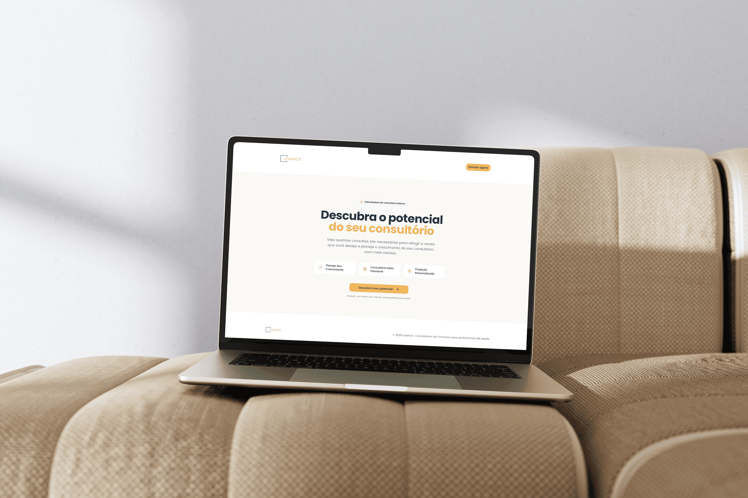
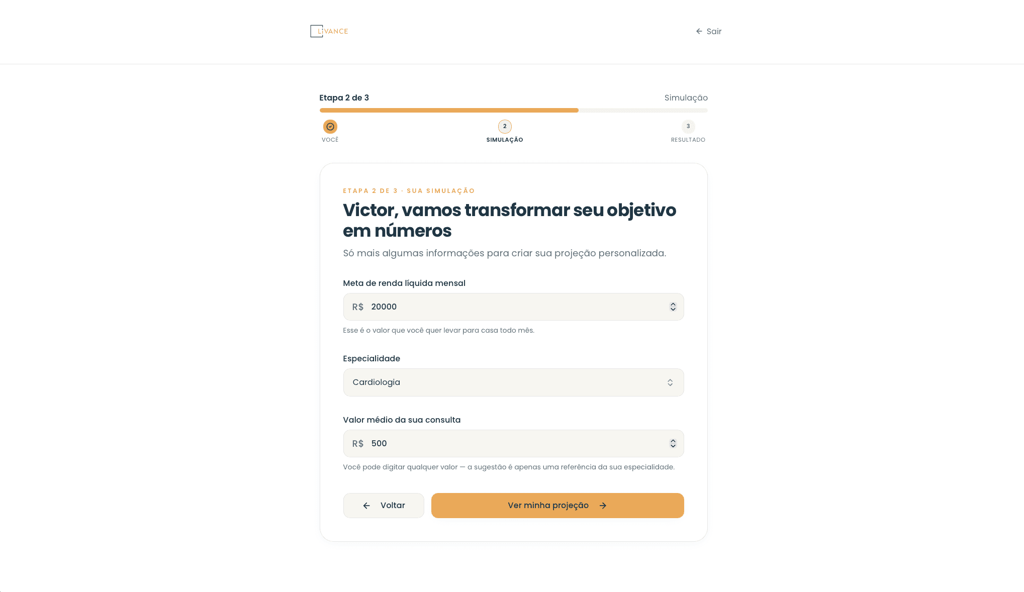
Educational resources, mentorship programs, practical tools, e-books, calculators and video content were developed to help professionals solve real challenges before introducing commercial solutions.
The objective wasn’t to generate more content.
It was to generate more value.



04. Content as
a Growth Strategy
Education became the first step of the customer journey.
Instead of driving paid media directly to commercial offers, campaigns introduced valuable educational resources designed to build trust over time.
This strategy connected content marketing with performance media, improving lead quality while creating a more sustainable acquisition funnel.


05. Bringing the Positioning to Life
Turning strategy into a clear and tangible brand story.
Once the new positioning was defined, it needed to become visible.
A brand film introduced Livance as more than a place to see patients. It presented a complete environment for building an independent practice, combining premium consulting rooms, flexibility, technology, community and business support in one clear proposition.
The film transformed the strategy into a tangible promise:
more freedom for healthcare professionals, a better experience for patients and more structure for sustainable growth.
More than a space, Livance became the structure behind an independent practice.
06. Designing the
Arrival Experience
Livance offered an experience built around simplicity, autonomy and care. The communication strategy translated these qualities into clear and compelling narratives across campaigns, social media and other brand materials.
Through photography, copy and creative assets, features such as digital check in, streamlined payments, welcoming spaces and attentive service were presented as part of a connected experience for healthcare professionals and their patients.
Technology was not communicated as an isolated feature, but as a tool that reduced friction and made every interaction more seamless and human.
Every piece reinforced the same message: Livance reduces friction so healthcare professionals can focus on what matters most, caring for their patients.

07. Scaling the
Creative Operation
Building the system behind a consistent brand.
To sustain this experience across campaigns, channels and units, creativity needed a reliable operating system.
Workflows, documentation, modular templates and AI assisted processes made production faster and more consistent, while reducing repetitive work.
This gave the team more time for strategy, concept and craft, turning creative operations into infrastructure capable of growing with the business.
Scale was not about producing more at any cost. It was about growing without losing quality.
08. Measuring
the Impact
Creative work became a measurable growth engine.
Clearer positioning, valuable content and scalable creative operations generated impact across the entire funnel.
Customer acquisition cost decreased by 20%. Paid campaigns achieved higher CTR, lead generation became more qualified and the content ecosystem became easier to scale.
At the same time, Livance strengthened brand consistency and built greater authority among healthcare professionals, showing that creative quality and business performance could grow together.

Reflection
Building a Brand Beyond Its Product
Brand is the consistency between what a company promises, delivers and enables.
By aligning positioning, content, the physical and digital experience, and creative operations around the needs of healthcare professionals, Livance moved beyond offering consulting rooms.
It became a partner in building stronger, more independent practices.
The project demonstrated that sustainable growth happens when every part of the brand works as one connected system.
